Travel journal Brand identity
9 things every brand identity needs (besides the logo)
Logo, colors, fonts, brandbook and more: here's everything a complete brand identity should include, so you can see what's missing in yours.
One of the questions we hear the most: what do I actually get in a brand identity? And it's a good one. If you're investing in your brand, you deserve to know what's going in the suitcase.
Most people think of the logo, and only the logo. We get it, it's the star of the show. But a logo on its own is a bit like a passport photo. It says who you are, and that's about it. The brand identity is the whole suitcase: everything your business needs to look like itself everywhere, from the Instagram grid to the sticker on a paper bag.
So here's our packing list. Use it to check what you already have, what's missing, or what to ask for when you hire a brand designer.
1. Brand strategy (the map)
Before anything visual comes the base: who the brand is for, what makes it different, how it talks, what it values and where the business is going. Without it, everything below is a pile of pretty files. With it, every piece points the same way. (We wrote a whole post on why strategy comes before the logo, if you want the long version.)
2. Logo versions, not just one logo
Your logo has to work on a storefront AND on a tiny profile picture. That's why a complete brand identity comes with a few versions:
- Primary logo: the full version, for when there's room.
- Secondary logo: simpler or rearranged, for tight spaces.
- Submark or monogram: a small symbol for profile pictures, stickers, stamps and the little icon on your browser tab.
- Color variations: so it works on light and dark backgrounds.
3. A color palette
Main colors, supporting colors and a couple of accents, each one with a role, plus the exact codes for print and screen (CMYK, RGB and HEX). Color is one of the first things people remember about a brand, so we choose it on purpose, never just because it's trendy this season.
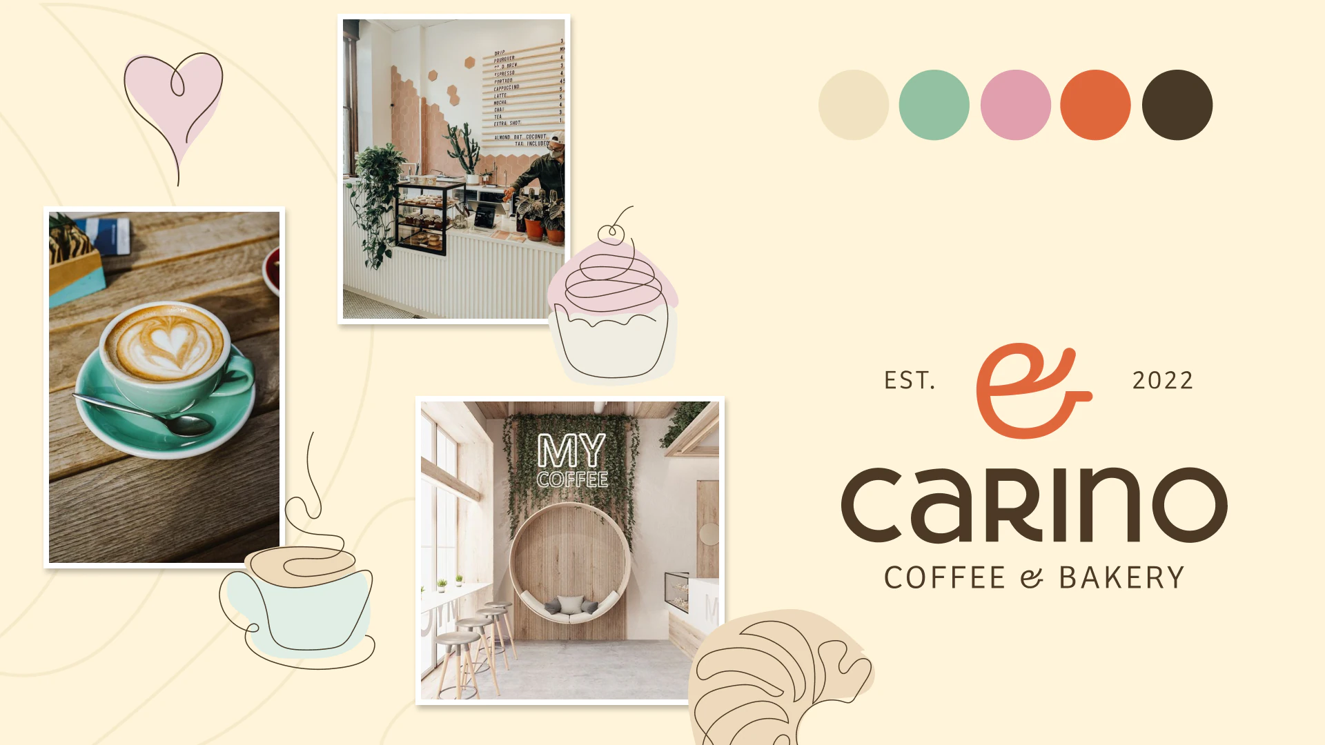
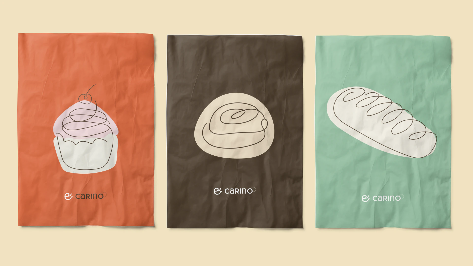
Carino is a coffee shop in Belgrano, Buenos Aires, where every coffee and every pastry is made with care. The brand had to feel minimal, delicate, modern and sophisticated, and you can see it in the soft palette and the fine line drawings.
4. Typography
Usually one or two typefaces that match the brand's personality, with clear rules for titles, body text and highlights. Fonts say a lot more than people think. A rounded, playful letter and a tall, elegant one tell two very different stories.
5. Graphic elements, patterns and illustrations
This is the part that makes a brand look like YOU and not like a template. Shapes, patterns, textures, icons and illustrations you can use again and again, so people recognize your brand even when the logo isn't there.
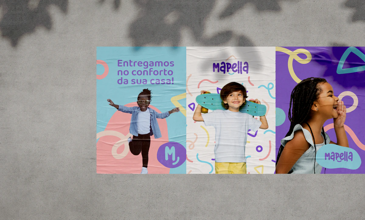
Mapella is a Brazilian children's clothing store. Its identity was built with basic shapes, in a modular way, so it can keep changing the way a child's imagination does. The letters have rounded ends, and the E and the P form a smile. Small details, but they make the brand feel like play on every poster, bag and post.
6. Photography direction
Even if you're not booking a photoshoot this month, your identity should say what your images look like: the light, the colors, the framing, what to show and what to skip. At Buenas this starts with two mood boards made just for you (you pick one), so we agree on the direction before we design anything.
7. Brand guidelines (the brandbook)
The guidebook for everything above: how to use the logo, the colors, the fonts and the graphic elements, and what NOT to do with them. With a good brandbook, anyone who designs for you, today or five years from now, keeps your brand consistent.
8. Real-life applications
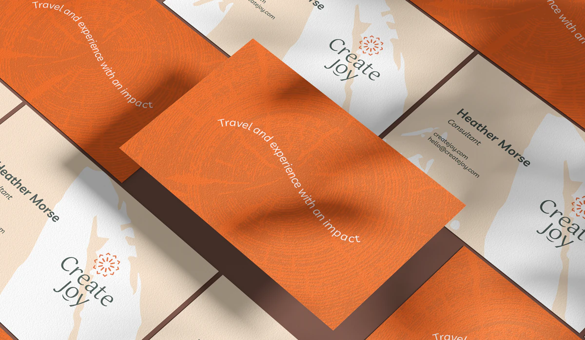
This is where you see a brand identity working for real: off the screen and in people's hands. Depending on your business, it can be business cards, an email signature, social media templates, packaging, menus, signs or merch.
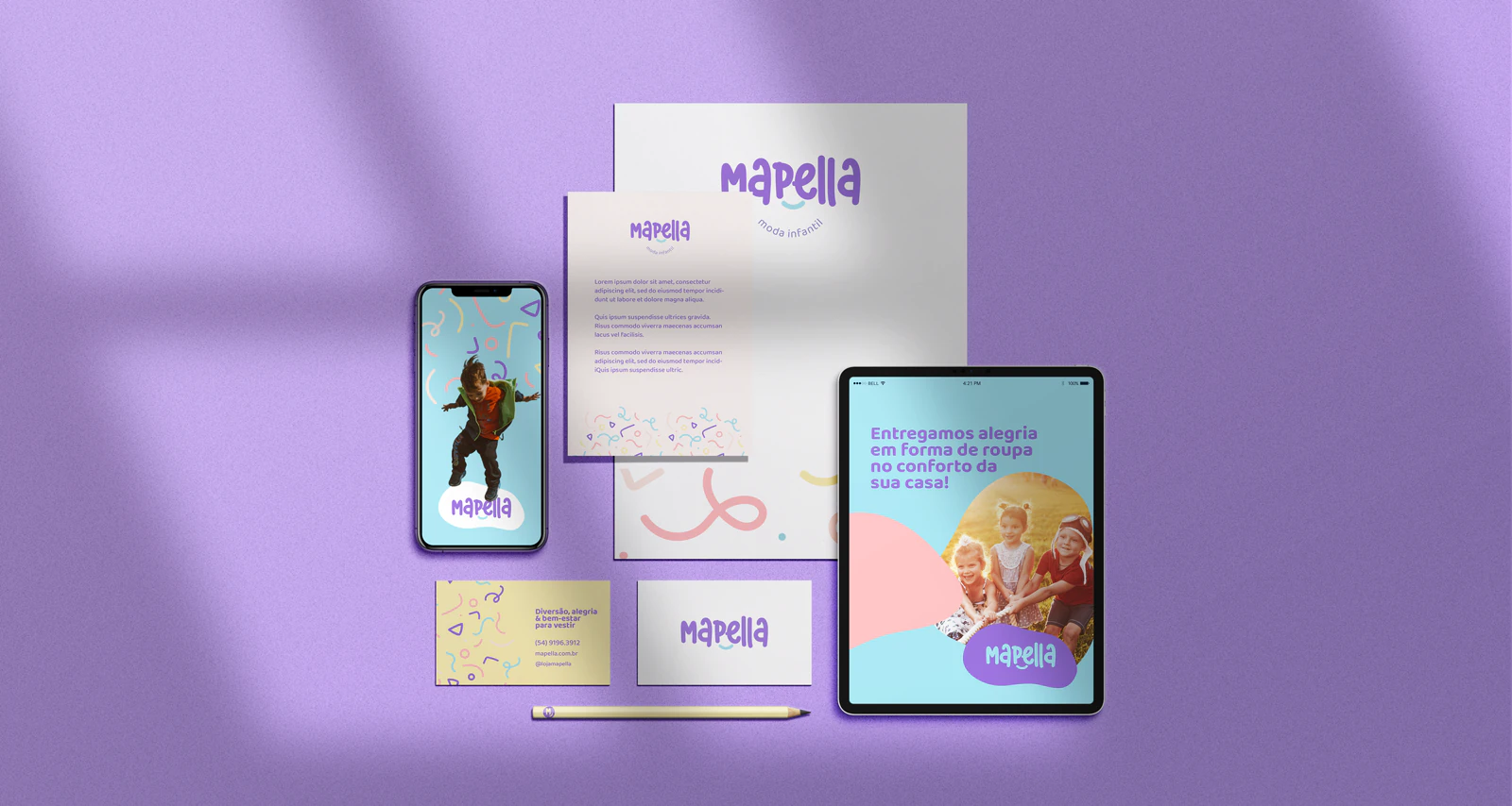
9. A brand asset library
And finally: all your files organized in one place, in the right formats for print and web, with the color codes and font names. Sounds boring, right? Until you need your logo in high resolution five minutes before a deadline. (We've all been there!)
A logo gets you recognized. A brand identity gets you remembered.
Your brand identity checklist
Go through the list and look inside your suitcase. A few things missing? Totally normal, especially if your business grew faster than your brand. If more than half is missing, it might be time for a new itinerary.
And if you'd like the whole suitcase packed by people who do this every day, take a look at our brand design services. We'd love to plan this trip with you.